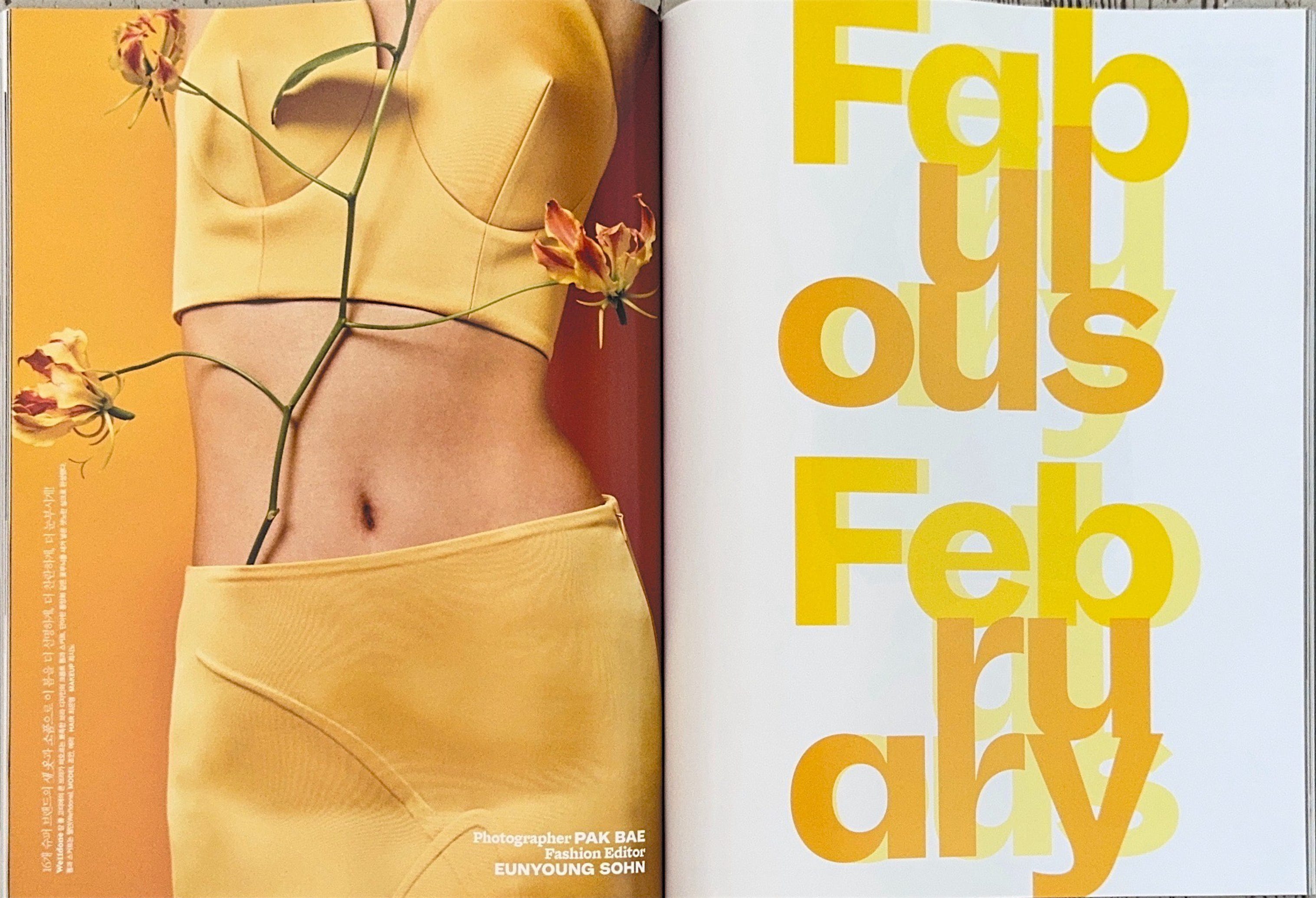
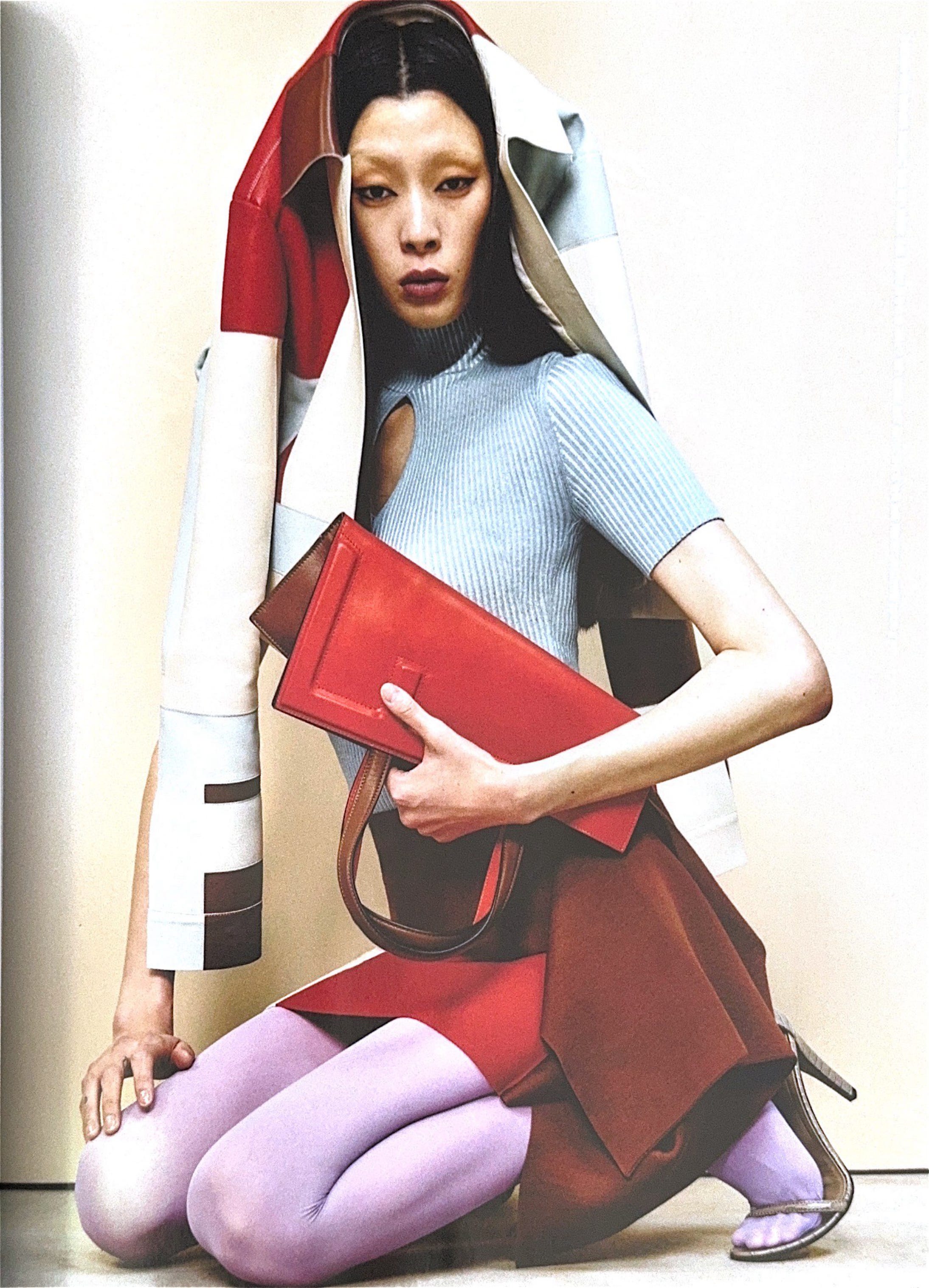
If you read the last weeks WTF then you’ll know I was feeling a tad overwhelmed and uninspired, I had a thousand ideas but none felt quite good enough to put into action. My screen time was also scarily higher than usual, so I decided to go back to basics. I grabbed a few of my favourite magazines, a notebook and a matcha ginger beer (wow), then set myself up in the garden on a blanket in the sun. My thought process was that I’d lazily flip through and see what trends, outfits and ideas stuck out to me and which of those sparked a thought that could grow into an interesting newsletter. First up was the below issue of Vogue Korea from February 2024, I found in a tiny shop at the back of Koreatown Plaza in LA and was immediately drawn in by the incredible cover. The styling is perfect, but what I loved most was the choice of colours, and how well they complimented each other.
Throughout the rest of the trip I kept it carefully placed in my bag and took it from LA to Vegas, back to LA and then to the UK all without so much as creasing it. After finally making it home with a brain fried from jet lag, I popped it on my stack of magazines and somehow never took the time to actually look through it. But as I was laid in my garden, I didn’t even make it halfway through without knowing it deserved it’s own newsletter.

I often struggle when looking for unique colour combinations, whether it be for a creative project or even just when I want to put together a new outfit. It can be so tough to find good inspiration and think outside the box! Even when I see a cute combination in the wild, it always slips my mind before I can remember to note it down.
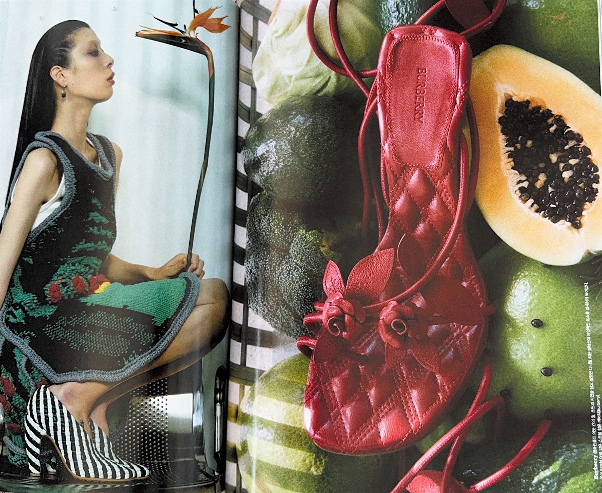
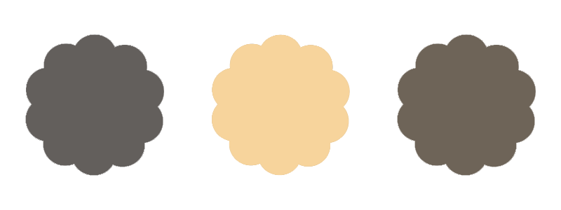
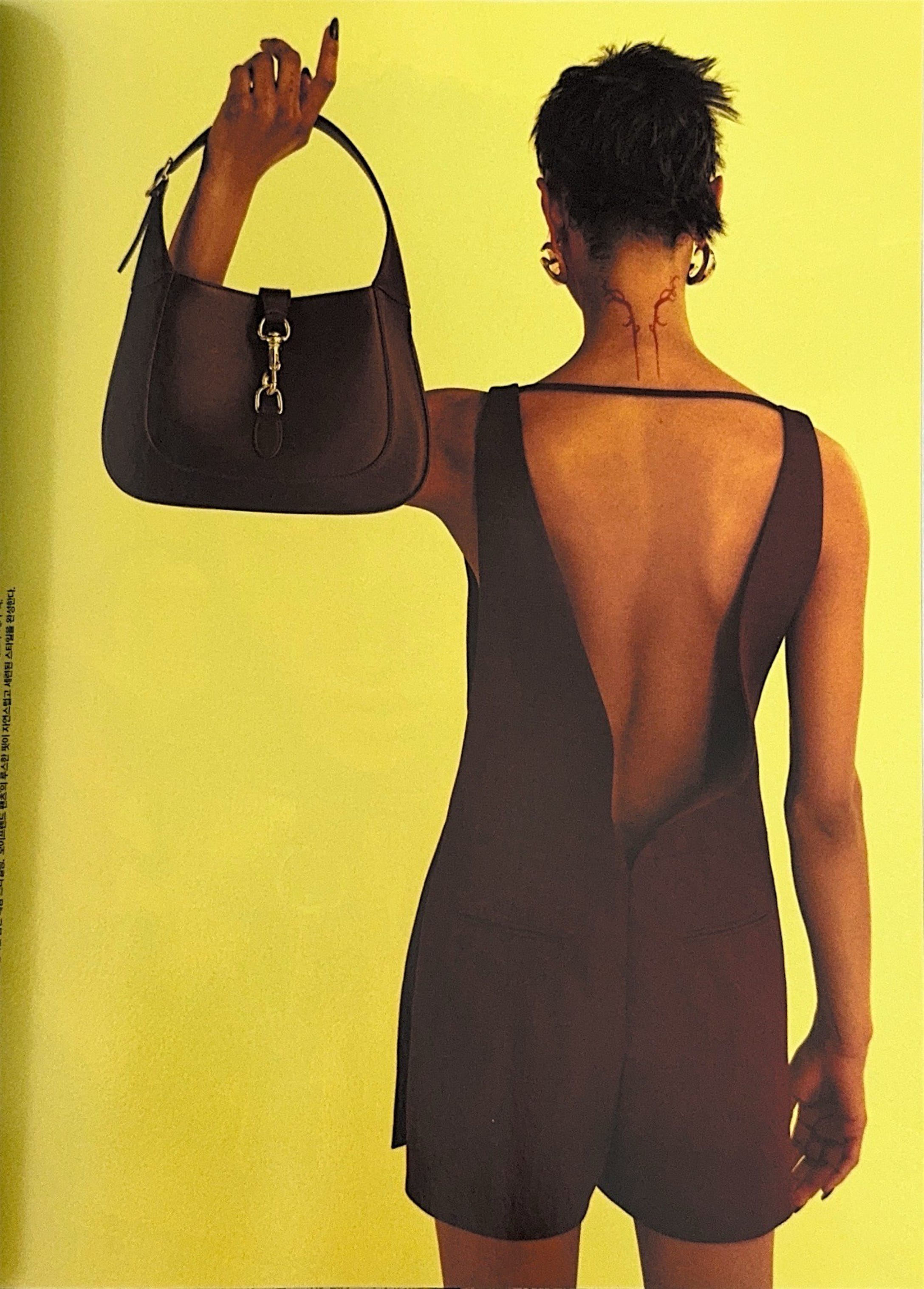
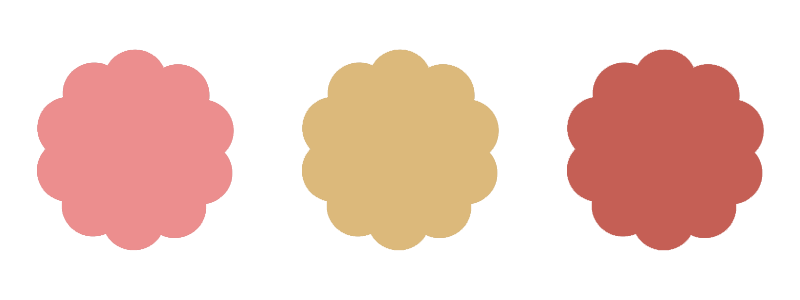
As soon as I started flipping through Vogue Korea, I was absolutely blown away by the colours. It felt like every single page had mixed them in ways I’d never thought of or seen before. So, I thought why not scan in my favourite pages for us all to enjoy together? and maybe for you to refer back to when you also need a little inspiration? I hope you enjoy.